Recent searches
Search options
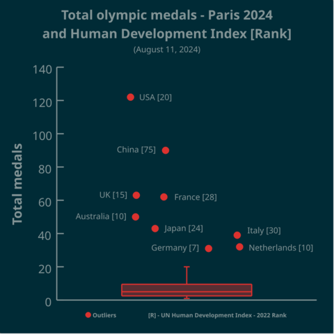
Total olympic medals won in Paris 2024 and Human Development Index
https://www.businesstimes.com.sg/opinion-features/what-olympic-medal-table-really-tells-us
After reading the article we made this #boxplot using #LabPlot, an open source data analysis and visualization software.
The plot doesn't provide answers, it rather invites some thinking.
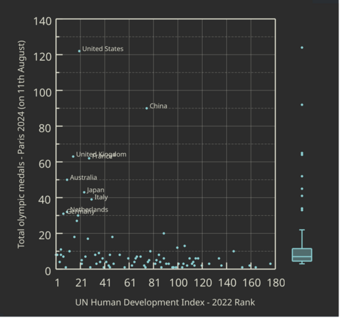
Thank you for all your comments. A jittering of data points along the x-axis was used to avoid over-plotting. But yes, a scatter plot with a boxplot attached along the y-axis (to show outliers) may be more informative in this case.
This is not beautiful, this is confusing.
Why are the Nederlands with a index of 10 more ro the right than Australia that happens to have an index of 10 as well?
The “information” of the x-axis is completely random or so it seems.
If you plotted medals (y-axis) over index (x-axis) there might be information in there.
Bit this? C’mon, thats embarrassing.
A boxplot is a 1-dimensional plot. The data points are jittered along the x-axis to make them less crowded.
More on boxplots here:
https://labplot.kde.org/2021/08/11/box-plot/
https://userbase.kde.org/LabPlot/2DPlotting/BoxPlot
“doesn’t provides answers but invites thinking”… Nope. Doesn’t even help that as the X-Axis is unlabelled
A boxplot is a 1-dimensional plot. The data points are jittered along the x-axis to make them less crowded.
More on boxplots here:
https://labplot.kde.org/2021/08/11/box-plot/
https://userbase.kde.org/LabPlot/2DPlotting/BoxPlot
Yeah, not a good way to visualize as the relationship between medal count and HDI is not obvious as only outliers get highlighted and the lack of information on other countries actually invite doubt as to the story that the plot is trying to tell (for example, Singapore and Hong Kong have extremely high HDI but the sheer smallness of their population is a factor against a higher medal count). There’s nothing wrong with a traditional 2D scatter plot and axis-related box plots plotted against each axis separately
This viz is shit because nobody can understand it.
1 dimensional visualizations are fucking stupid. The whole point of data viz is to simplify complex information; not make simple info complex.
A boxplot is a visualization tool to quickly get an idea of how the data is distributed. In this population the outliers are so large that the info the real box + whiskers give is very low.
In your title you suggest investigating a relationship between total Olympic medals and HDI - why not choose a scatter plot here?
That the number in square brackets refers to the HDI rank only get’s clear on the second look.
The outliers being distributed over the X-Axis is confusing.
Sorry but this visualization is not beautiful, rather the wrong method used that cannot display the hypothesis stated in the title.
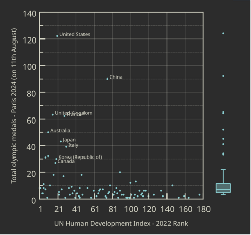
OP has tagged Canada but it’s not shown in the plot.
Only the names of outliers* have been displayed. South Korea and Canada are not outliers, but they are right after Germany, as you can see in this new plot (to avoid over-plotting Netherlands and Germany are not shown).
* the values lying beyond the value that is 3 times the IQR (the interquartile range) above the Q3 (the third quartile)
Please for gods sake use per capita


